

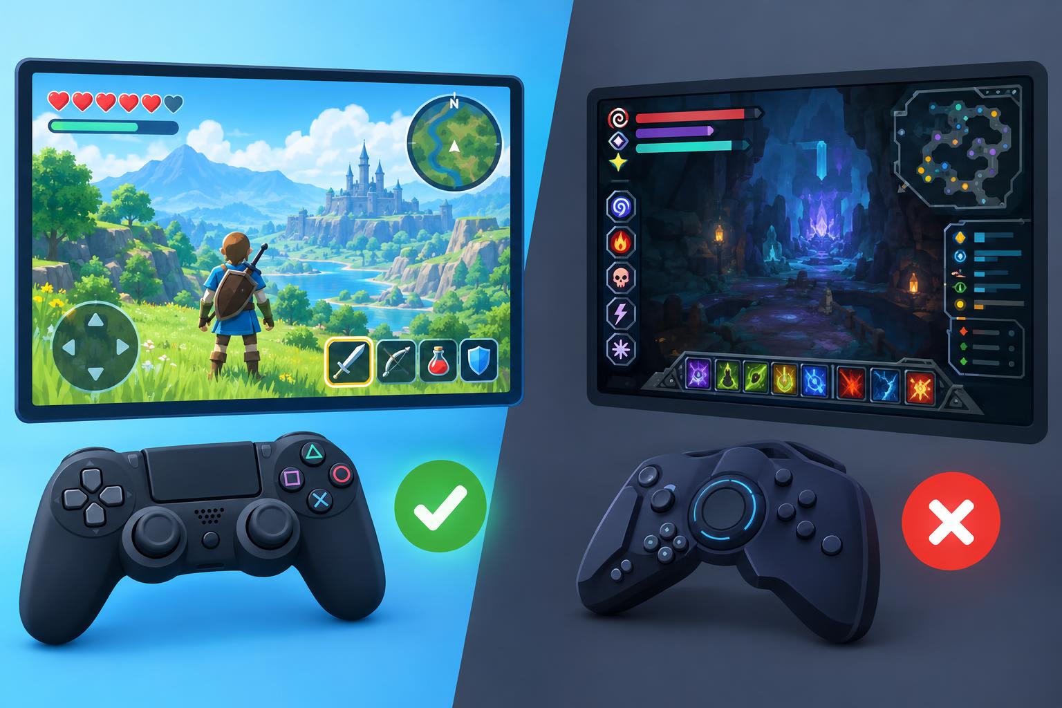
The first minute with a new digital product is often spent decoding it. Which icon starts the task? What can be moved? Which menu hides the useful option? Good interface design reduces that uncertainty. It gives people recognizable signals, makes important actions visible, and allows the purpose of the screen to become clear before a tutorial has to explain it.
Classic card games offer a useful example. Open PlaySolitaire and most players can identify the tableau, the deck, and the foundations before making a move. The browser delivers the game, but the familiar visual grammar does much of the teaching. Red and black suits, ordered columns, and face down cards already communicate relationships to anyone who has seen solitaire before.
Recognition is faster than translation
An interface becomes tiring when every control requires translation. A symbol may be elegant, but it is not useful if the user has to guess what it means. Familiar patterns reduce that effort. A magnifying glass suggests search, a triangle suggests play, and a card placed beneath another card suggests a sequence.
This does not mean every product should copy its competitors. It means originality should appear where it improves the experience, not where it forces users to relearn a solved problem. A designer can create a distinctive visual style while keeping the core actions predictable. The result feels new without feeling confusing.
The board can explain the rules
The strongest game interfaces teach through the arrangement of the play space. In solitaire, the separated foundations imply a destination. Overlapping tableau cards show order while keeping the values visible. Face down cards create an obvious promise that more information can be uncovered. The board does not need to describe every strategy to make the immediate goal understandable.
Clear feedback completes the lesson. A legal move should respond immediately. An unavailable move should fail without leaving the player unsure whether the input was missed. Small details such as card spacing, contrast, and touch targets determine whether familiar rules remain easy to use on a smaller screen.
A short path to the first meaningful action
Many digital products delay their value with account prompts, preference screens, and feature tours. Some of those steps may be necessary, but each one increases the distance between arrival and purpose. A simple game shows the benefit of reaching the first meaningful action quickly. The player opens the table and moves a card. The product has already demonstrated what it is for.
This principle applies beyond games. A writing tool should let the user write. A calendar should make the next appointment visible. A shop should help a visitor understand what is sold before requesting personal details. The sooner a person can complete one genuine task, the less abstract the product feels.
Familiarity still needs careful adaptation
Moving a physical activity onto a screen is not a matter of copying its appearance. A deck on a table can spread across more space than a phone allows. A finger is less precise than a mouse. The digital version may need larger targets, automatic card movement, or a way to undo an accidental action. These changes support the familiar model rather than replacing it.
The challenge is to preserve what players rely on while improving what the medium can handle. Too much automation can make choices feel meaningless. Too little assistance can make routine actions awkward. The best balance keeps the player in control and lets the software handle only the friction that adds nothing to the game.
Simple does not mean unfinished
A familiar interface may look obvious once it works, but that clarity is usually the result of many decisions. The designer has chosen what to show, what to hide, how to respond, and when to stay silent. Every unnecessary element removed from the path makes the remaining choices easier to understand.
Solitaire has lasted across physical decks, desktop computers, and browsers because its central visual language survives each transition. The technology changes, but the player still sees a set of cards and understands that order must be created from uncertainty. That is a valuable lesson for any digital product. When the interface respects what people already know, they can spend less time learning the screen and more time using it.
